Uncle Butters:
2025
Uncle Butters is a cheerful reimagining of a kitchen classic, designed to bring warmth, nostalgia and everyday joy back to the table.
Brief
Reimagine a packaged product category to deliver a consumer experience that is both functional and meaningful.
Creative Direction - Packaging
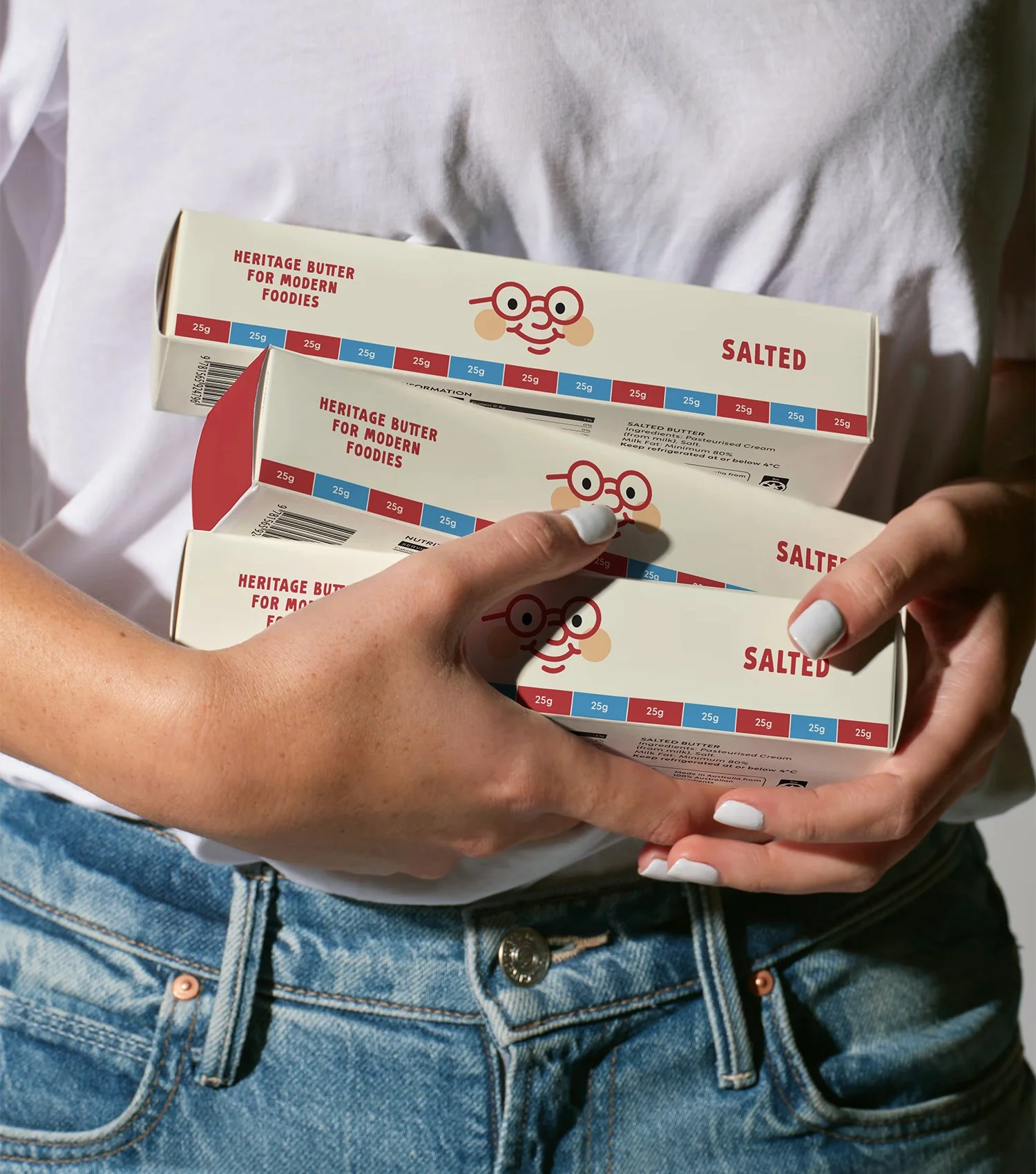
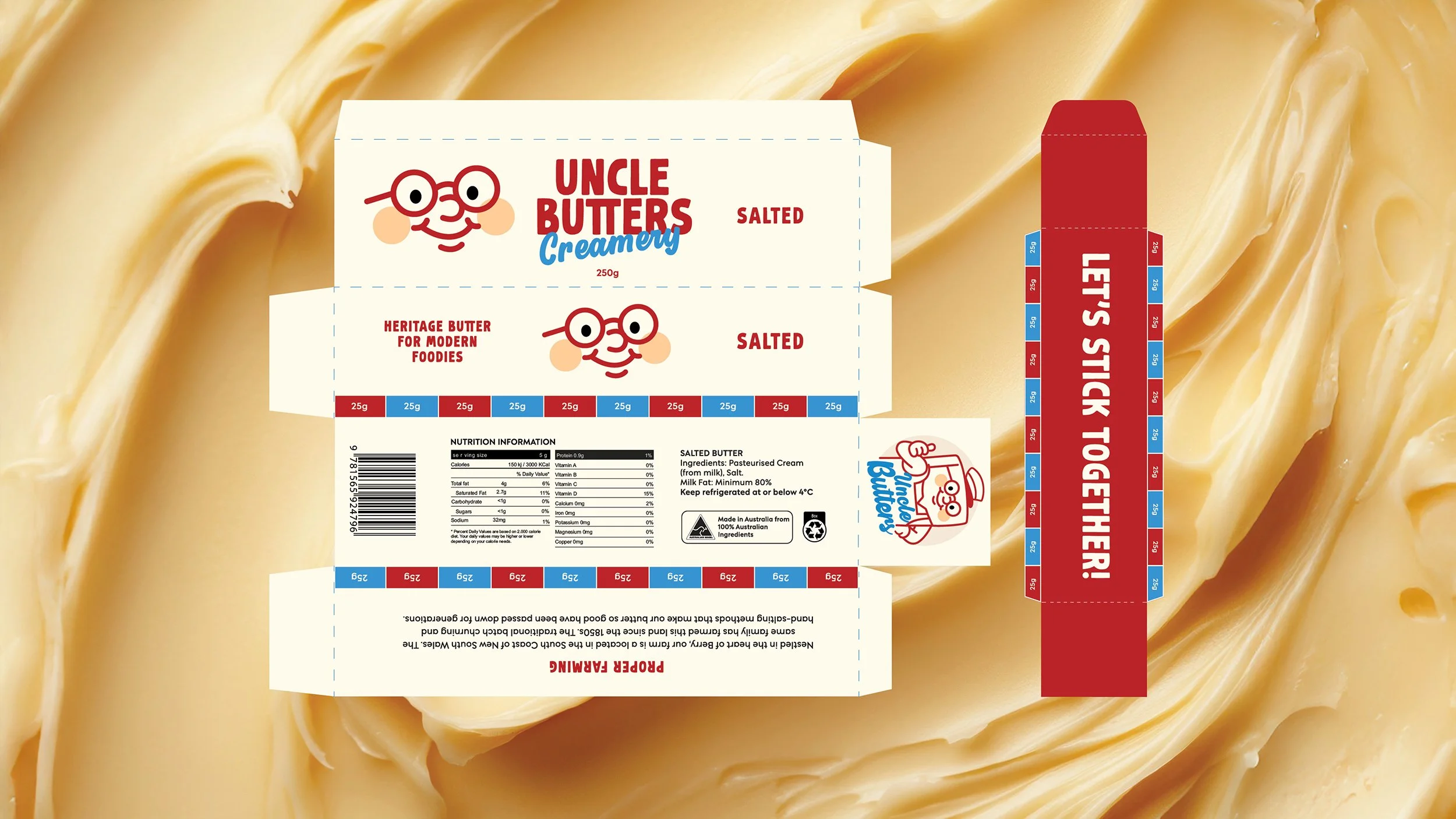
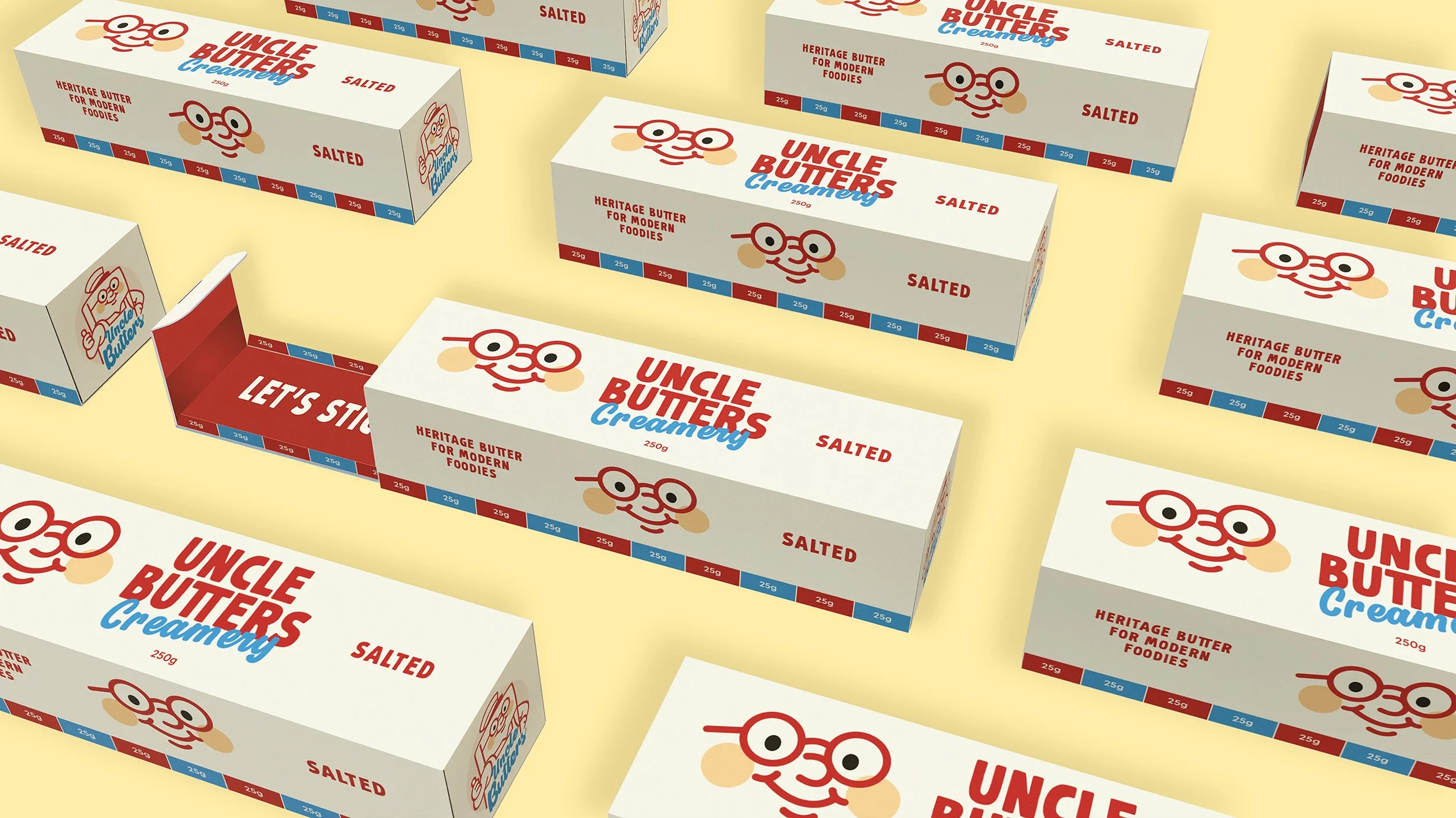
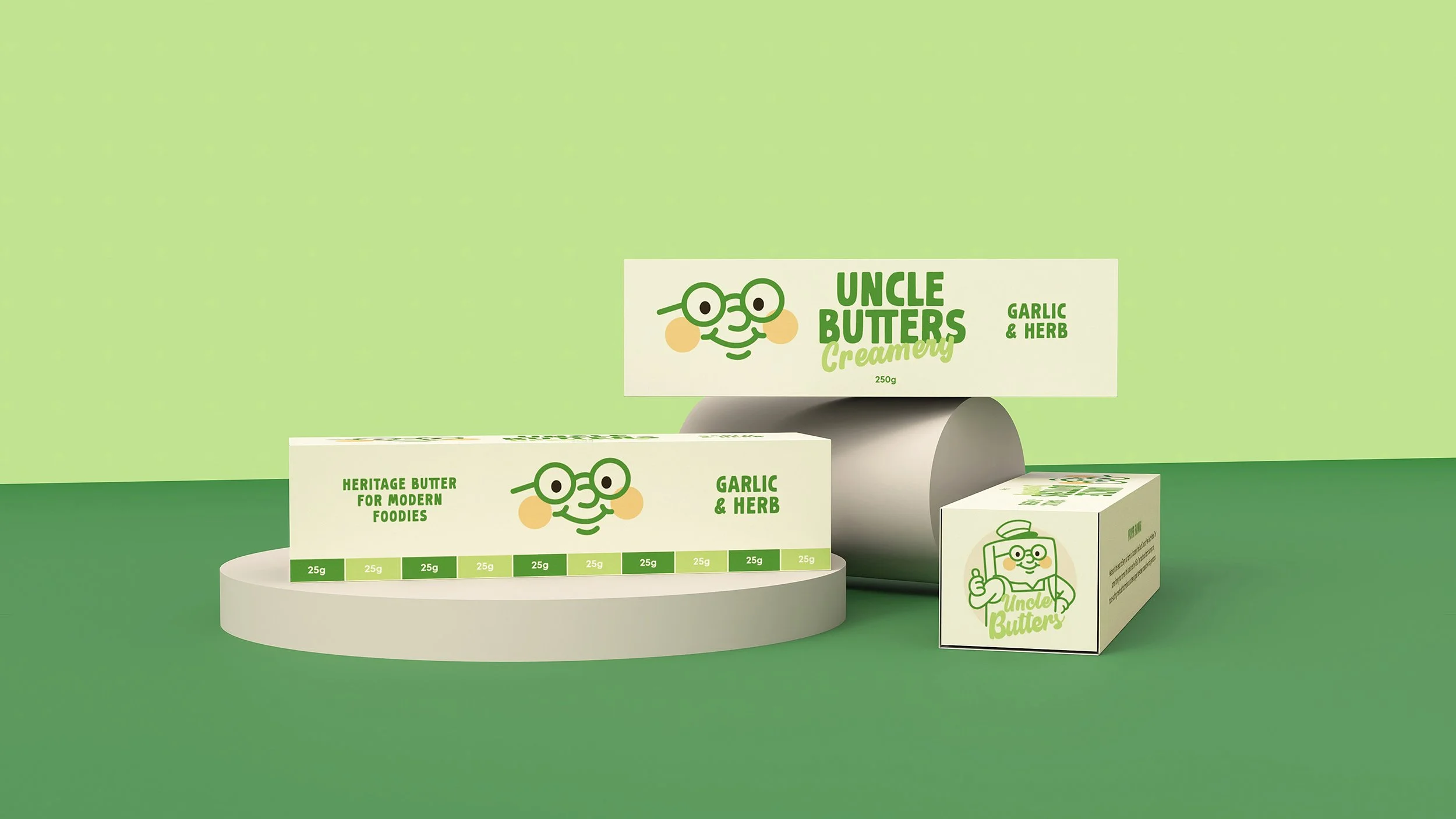
Butter is a kitchen staple often overlooked in design innovation. My aim was to elevate both its visual appeal and everyday usability through a user-centred approach. Research showed that modern consumers value packaging that is attractive and practical, easy to open, reseal, store and clean, with minimal mess, while also being portable, portioned and sustainable.
Uncle Butters responds to these needs with a sliding inner drawer system for cleaner handling and storage, removing the hassle of rewrapping. Built-in 25g portion markings support precision and reduce waste, while recyclable paperboard with a Biopak-style greaseproof insert extends shelf life. Prototyping refined the structure and resolved fit issues, resulting in a smooth, functional dieline that balances form, function and the brand’s warm, playful personality.
PACKAGING - DIELINE - BRAND NAMING - VISUAL IDENTITY
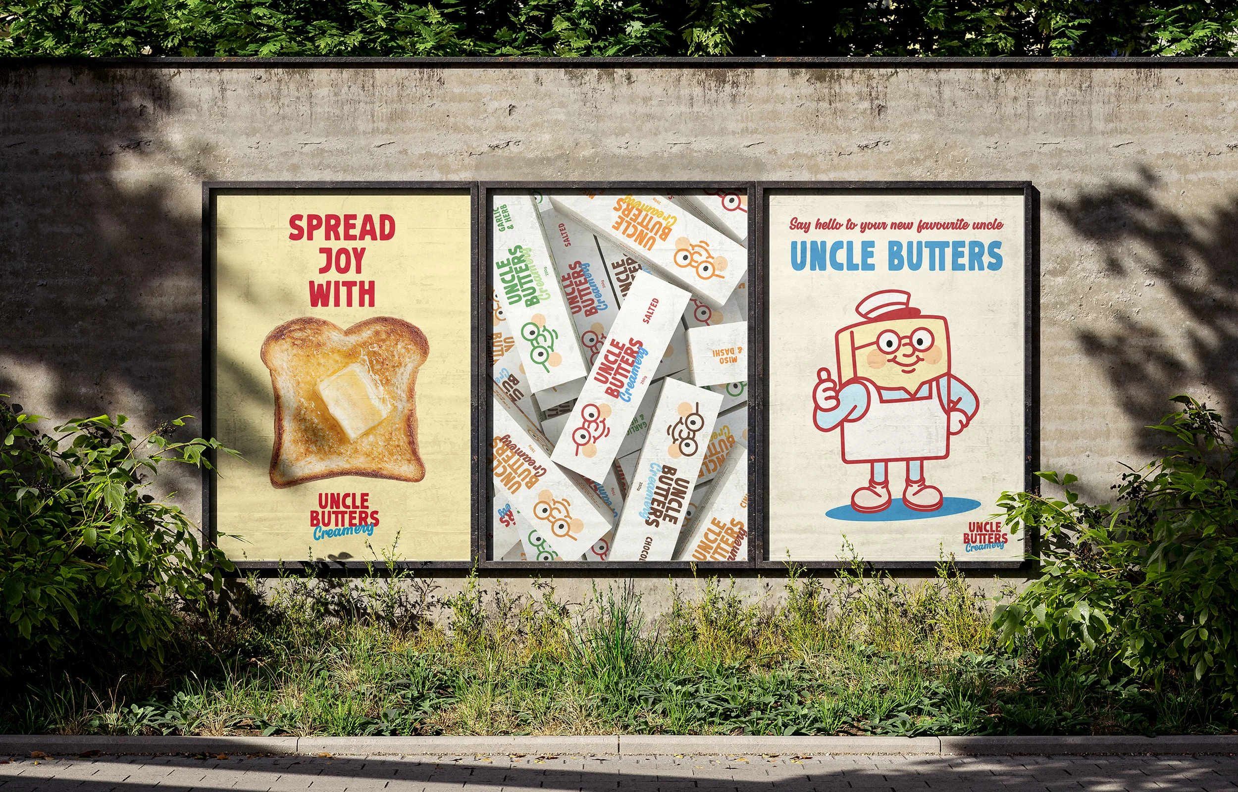
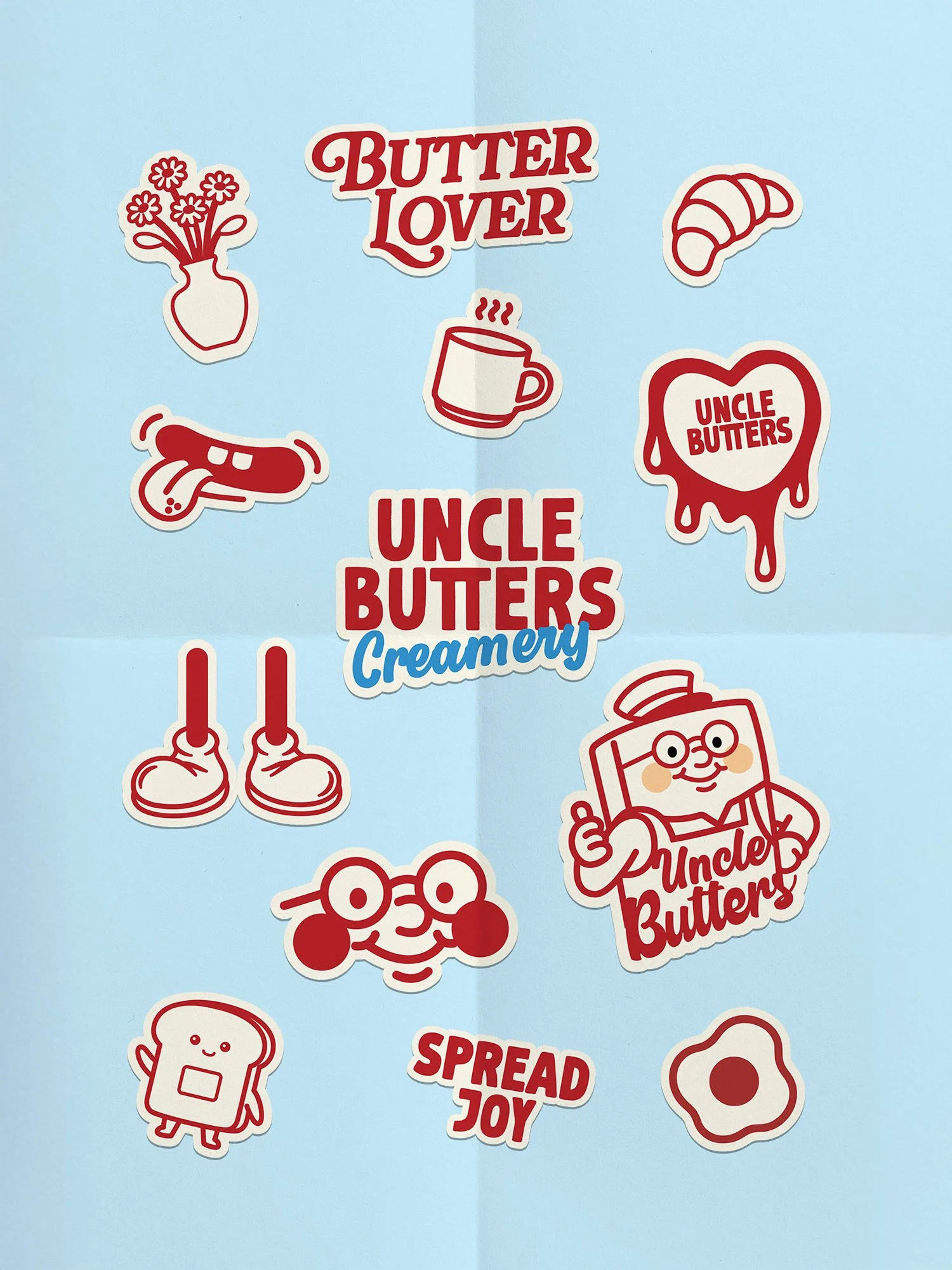
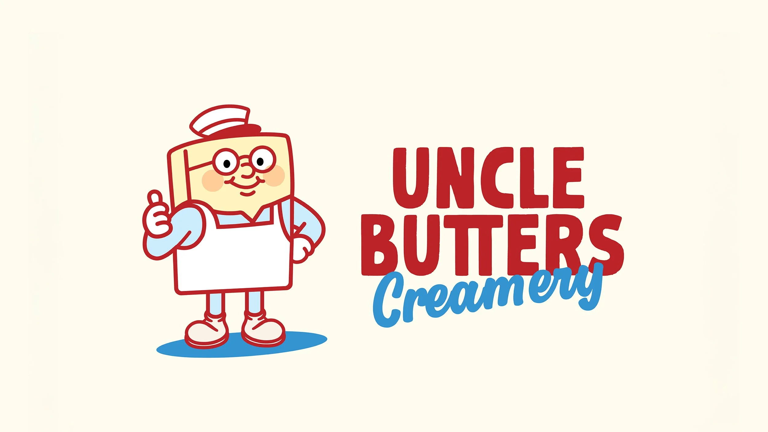
Brand Identity
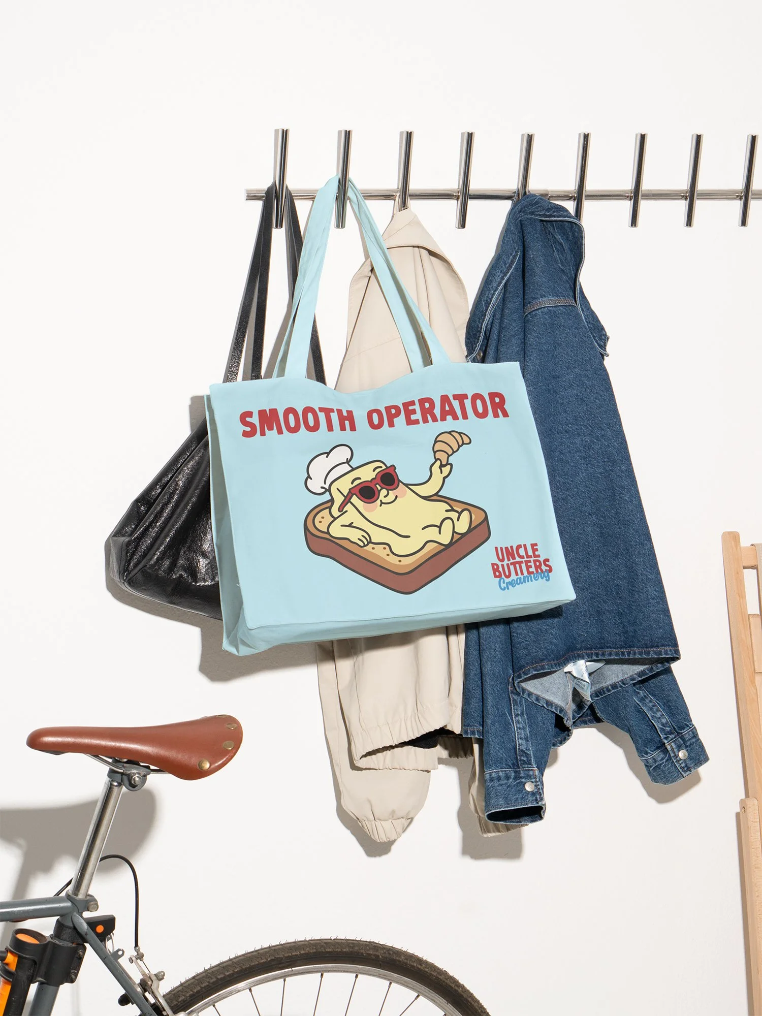
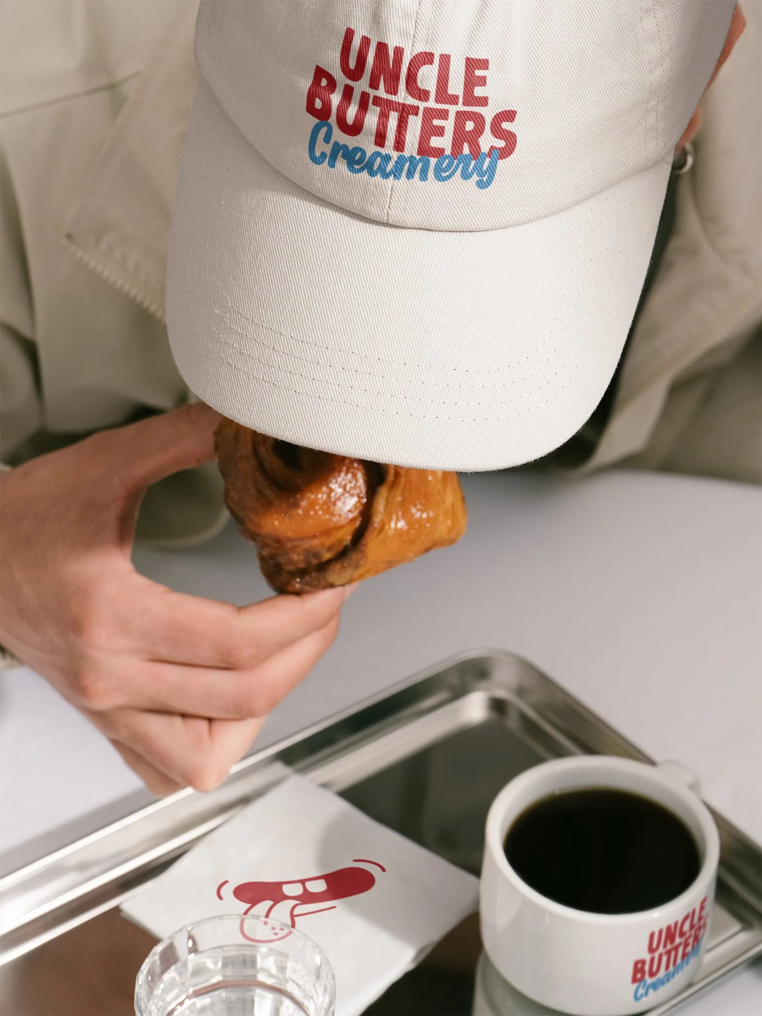
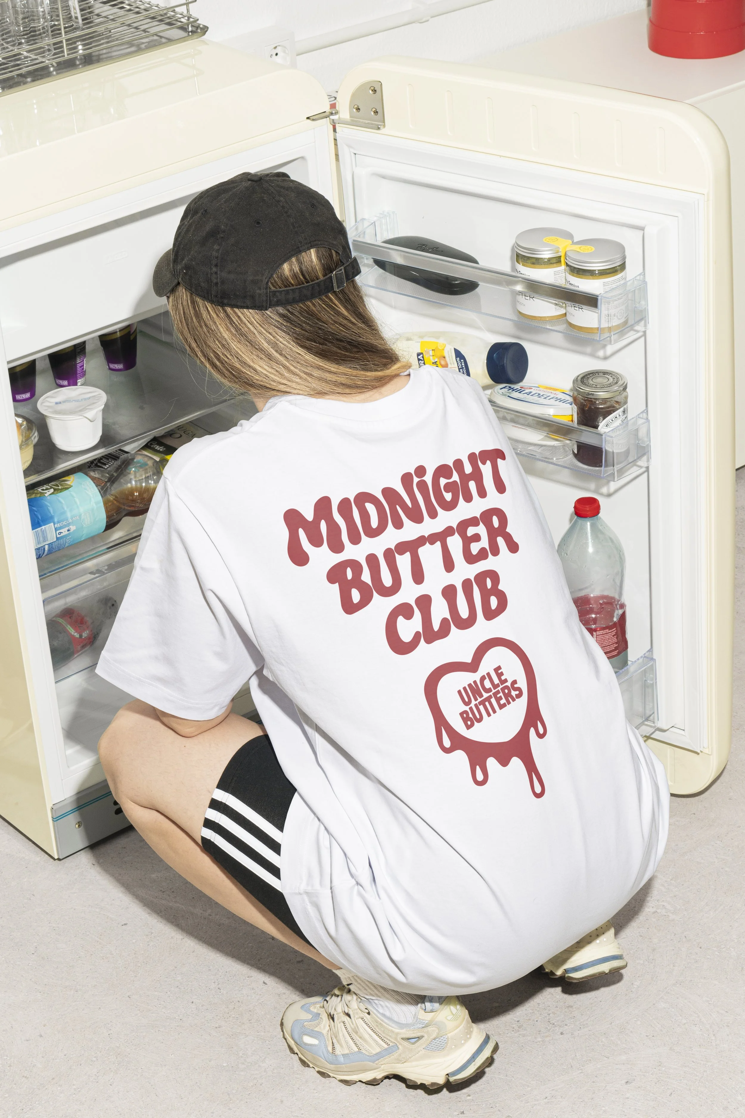
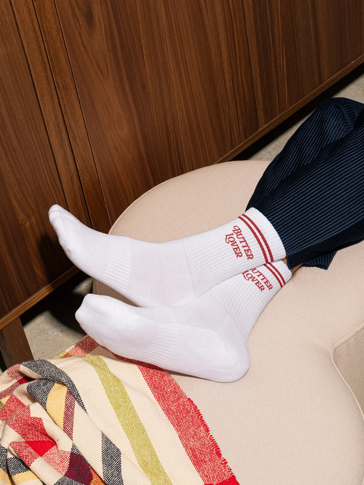
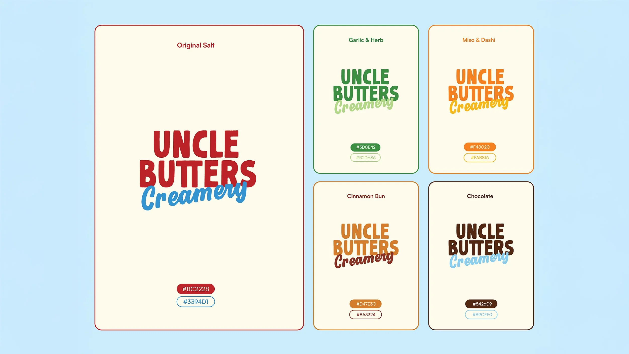
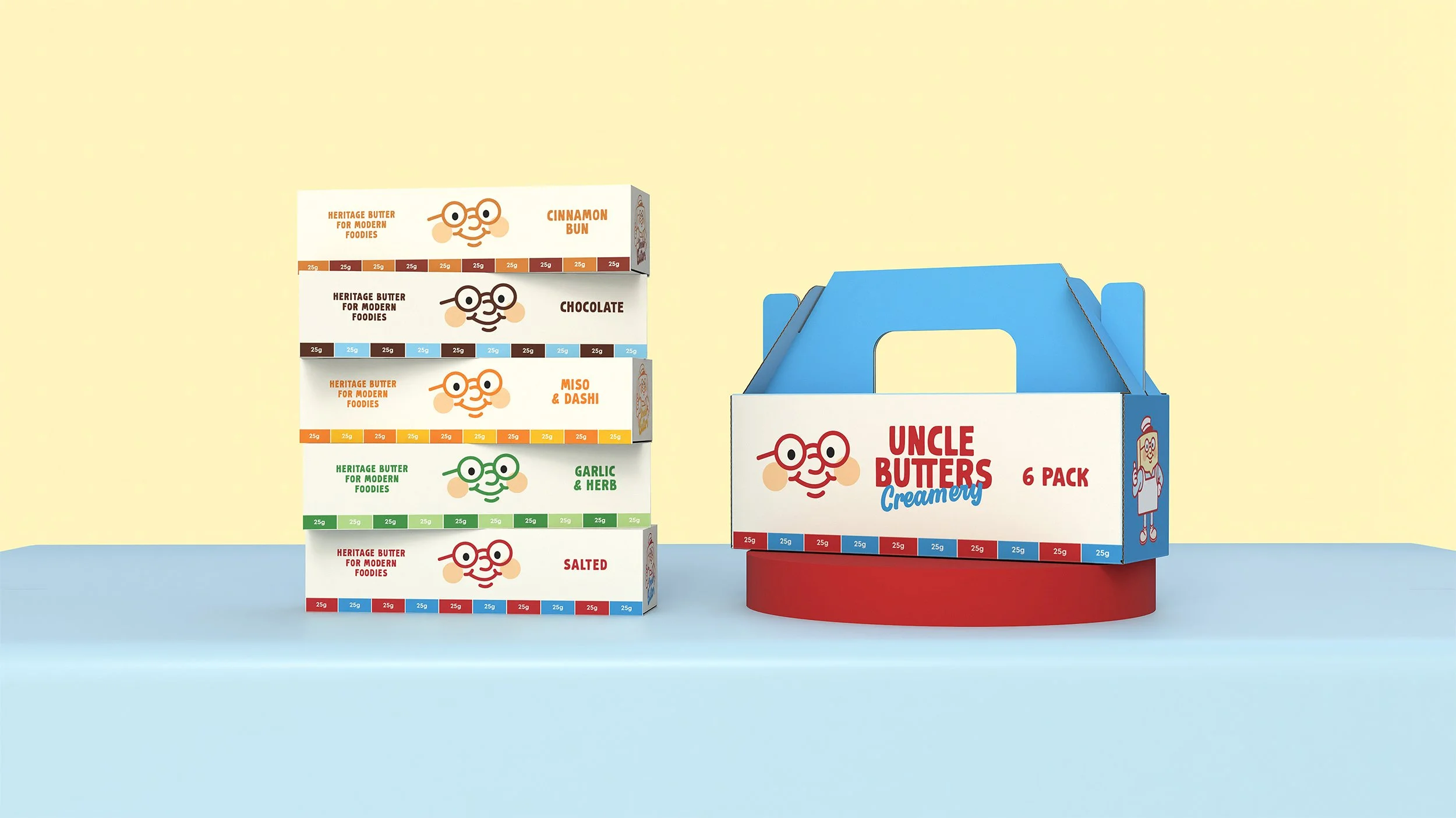
Uncle Butters Creamery was created to embody a warm, playful personality while delivering practical value. The logo combines bold red type with vintage blue script, inspired by mid-20th century milk bar signage, and is brought to life by a cheerful milkman mascot that makes butter feel fun and familiar. Designed for adaptability, the identity allows colour variations to distinguish flavours while maintaining strong recognition. Supporting collateral uses soft pastel illustrations and playful taglines such as “Smooth Operator” and “Midnight Butter Club,” extending the brand’s upbeat, approachable character across packaging and merchandise.